Room study 03 / Line, texture, light
Let the Veining Speak
A slab is not a repeating wallpaper. Its pattern has a particular scale, direction and interruption. Compose with those qualities before choosing a second expressive material.
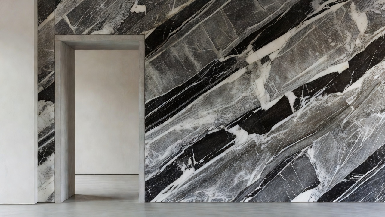
Read from a distance
The vein is a line of movement
A diagonal vein can make a still room feel active. A near-horizontal band can steady a long wall, while a vertical rhythm may emphasise height. These are compositional effects, not fixed laws: furniture, openings and lighting can reinforce or contradict them. Begin by identifying where you first see the stone and where you spend the most time.
Mark the intended viewing positions on the plan. A slab selected for its appearance straight on may be experienced mostly at an angle from a corridor. A dramatic feature at the bottom of a wall may disappear behind a sofa. The useful question is not simply whether the pattern is beautiful, but whether its important moments remain visible.
Photograph the actual slabs and place them in a scaled elevation. Keep the doorway, sockets, taps and cabinetry in the drawing. Cropping out those interruptions produces a seductive image but avoids the design problem. A well-placed seam can settle a composition; a poorly considered opening can divide its strongest feature.
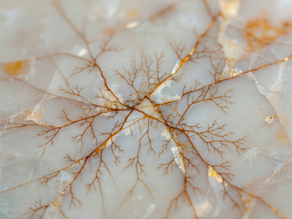
Matching with intention
Symmetry is only one option
Bookmatching places related slab faces so their pattern creates a mirrored effect. The result can be architectural and emphatic, particularly on a large uninterrupted plane. It can also create a central image so dominant that every other element feels secondary. Decide whether the room needs that focus before committing to it.
Vein matching seeks continuity across adjacent pieces; other layouts may repeat a directional relationship without forming a mirror. Terminology can vary between suppliers, so use marked-up images and written approvals rather than relying on a label. Slab sequence, finish and availability all affect the possible result.
No natural match should be understood as a promise of perfect duplication. Mineral variation, cutting losses, repairs and differences in how surfaces reflect light can remain visible. Ask the fabricator to explain achievable alignment and tolerances. Keep movement joints and construction requirements within that conversation rather than treating them as an aesthetic afterthought.
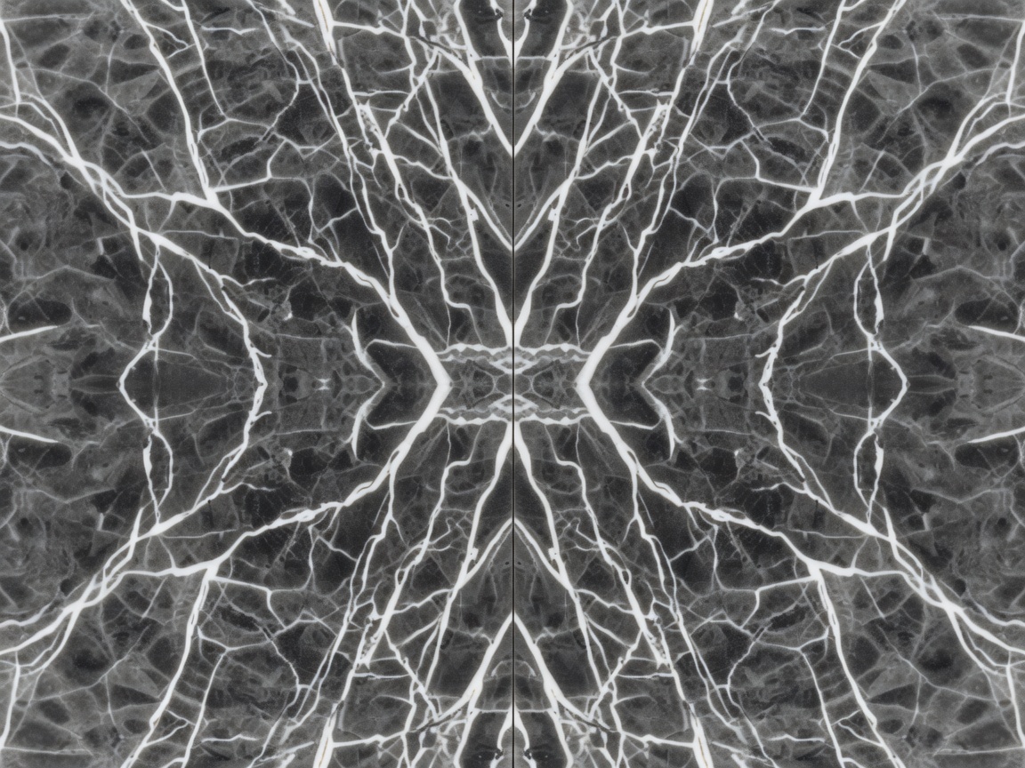
Texture is the meeting of surface and light
Polishing, honing and textured treatments alter how a stone is perceived. The same slab may read as sharply graphic under a reflective finish and more atmospheric under a diffuse one. Surface processing can also reveal variation differently. Review a sample of the intended finish rather than assuming the showroom’s polished display represents every option.
Move the sample through daylight and the proposed artificial lighting. A warm lamp may emphasise cream and amber tones; a different light can change the apparent relationship with paint, metal and timber. Compare materials side by side, in their intended orientation. A horizontal counter and a vertical backsplash receive light differently even when cut from the same batch.
Raking light makes small changes in surface level more apparent. That can be desirable on a textured wall and distracting where a perfectly even reflection was expected. Discuss finish variation and workmanship criteria before installation. Lighting should reveal the intended character, not create an unspoken test the chosen material cannot satisfy.
Give expressive stone a quieter neighbour
Composition often improves when materials perform different roles. Let one surface carry the strongest movement, another establish the dominant tone and a third provide tactile contrast. This is not a numerical rule. It is a way to ask whether every material is competing for the same attention.
A warm timber can make a pale stone feel less clinical without echoing its pattern. A plain plaster wall can allow an onyx panel or strongly veined marble to become legible. Metal details should be considered at the actual size of handles, taps and trims; a tiny sample may make a finish seem less assertive than it will be when repeated throughout the room.
Use history as a way of looking
The Pantheon in Rome demonstrates how coloured stone can articulate an interior through geometry and repetition. The Taj Mahal in Agra offers a different lesson in pale marble, controlled detail and changing light. Neither reference needs to become a literal style quotation. Look instead at the relationship between overall order and the material’s local variation.
Closer to a contemporary interior, the Barcelona Pavilion shows how an expressive stone plane can coexist with glass, metal and open space. The useful exercise is to notice what surrounds the stone. Its impact depends partly on the quiet elements that let its pattern remain distinct.